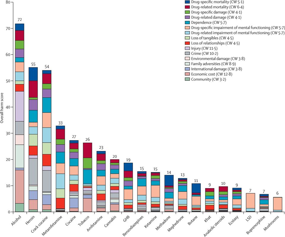
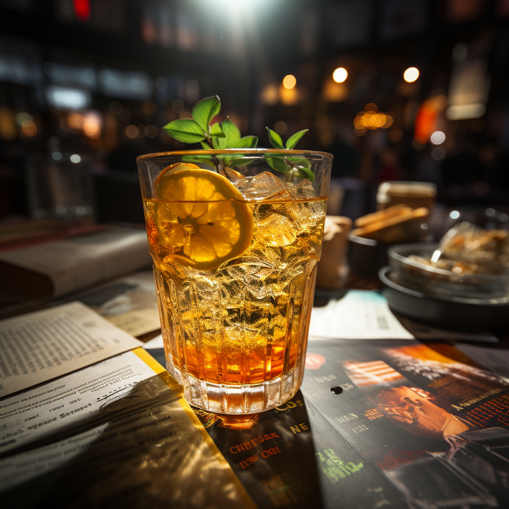
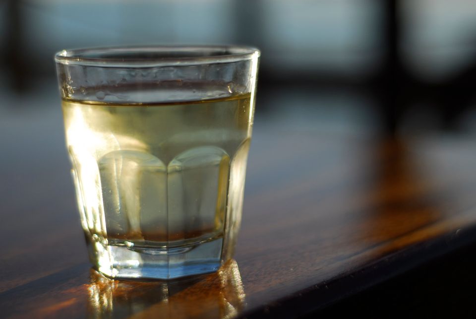
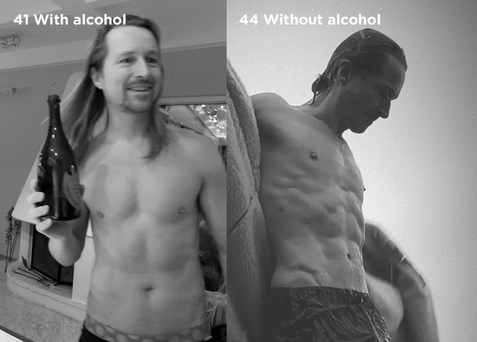
Walter's Blog

Technology, Artistry & Business

About Walter Contact Walter


Ok, my photographer father in law threw in a couple of extra iPads for effect, but this is actually pretty close to the truth of what the house looked like the day Snow Lion was relesased. Upgrade mania. :)


A few weeks ago I got a call from a friend asking me if I wanted to try out a car. – Well sure, I said, what kind of car? I have to admit I wasn’t overly excited when she told me it was a Hyundai. – It’s fun! she promised.

This was the Hyundai she brought me:

And this, ladies and gentlemen, is a 3.8 liter V6 Hyundai Genesis Coupé. And I’m telling you, it was NOTHING like what I thought a Hyundai would be. It’s probably the most fun you  can have in this price range. Boasting a good chunk over 300 bhp, all delivered to the rear wheel pair, this thing flies. And the Brembo brakes are great for when it’s time to land. Sure the interior finish and build quality is far from a Porsche or Audi, but the price tag is even further away. If you’re looking for a fun small car, this is in fact not a bad choice.

And I NEVER though I would say that about a Hyundai. Think about this in the context about brands and communication. If you’ve ever worked with us at Honesty you are very likely to have heard me rambling about “the communicative truth” more than enough. I don’t care how many times Hyundai pushes ads on me saying that they’re fun unless they have some hard evidence to prove it.  And this is exactly what the Genesis provides. It’s a brand statement. A communicative truth. It’s nothing new of course. In fact, launching a sports car is standard practice to ad “joy of driving” to your positioning diagram for car manufacturers, just think about the Audi R8 as an obvious example, but what’s fun about this car is that it, unlike the R8, is an affordable sports car, and as such it also says “affordable” about Hyundai without making it a boring proposition. And this is a pretty smart thing. What other brands can you think of that could adopt a similar strategy? I can think of a few.

One reason why I love Leica is because they follow their own path and aren’t shy when it comes to asking for cash. They have the audacity to ask $8000 (56000 SEK) for their M9-P, a camera most ordinary people would easily mistake for a large old (albeit retro chic) compact. And that’s for the body only mind you. The lenses put you back another few thousand a piece, like the 35mm 1.4 Summilux-M for $4995 (yes, Dollars) or why not a nice 21mm 1.4 Summilux-M for $6995 (a world record breaking lens, but still).

Now Leica are putting up another irresistible treat for us gear lovers, listen to this: The Leica M-Monochrome, a version of the M9-P that shoots… wait for it… only black and white! And the asking price? Well, it’s actually $500 or so MORE than the color version. You got to love Leica for this!

And though this might sound as pure provocation to the best of us, there is a logic behind all this. For those shooting black and white only, color enabled cameras do have some drawbacks as enabling the sensor to pick up three colors puts certain compromises on top resolution and noise, but going full monty and doing black and white only in an $8000 camera is the longest extension of a middle finger I’ve seen in a while. It’s fun. It’s bold. And I love it.

And do I want the camera? Are you kidding?! Saving up for it as we speak!

In only a few hours Tictail will launch their public beta. Make sure you sign up for one of those beta invites if your in the least interested in e-commerce. To me it’s looks revolutionary. Suddenly it’s not just that you can set up an e-store really fast (no, REALLY), but that somebody that is completely new to e-commerce and online marketing will actually get all the help they need throughout the entire process including marketing. And the basic version is powerful add-ons that you can buy for a buck a month or so.

And while everybody says that their service is “simple”, I’ve checked under the hood of this thing, and trust me, it’s simple. My dad could set up an e-store using this service (he would sell used vintage grand pianos I would imagine), and that says it all.

Oh, and it’s got a great feel to the design as wall and a big scoop of that “I don’t know what it is, but I want it”-magic that you sometimes see in the best internet startups. Very excited to see where this is headed.

I‘m out at Tech Days today to participate in Microsoft’s panel debate on future trends, I thought it could be nice to revisit a blog post I wrote last year in Redmond about my first thoughts on Microsoft’s new design language Metro.

Since writing that post I’ve gotten some more hands on time with my Lumia 800 and Window’s Phone 7. As I’ve written about before, my new Lumia never got me hooked since it forced me to reinvest in an all new batch of apps (or live without them as they don’t exist on the Windows platform yet). Design-wise however Window’s and Metro struck a note with me early on since I saw it as an unusually strong statement from Microsoft compared to earlier products.

Metro delivers on being true to a philosophy of clarity and function and clearly takes a “data first” approach to it’s design and let’s digital be digital without any analogue references to alien materials like wood or paper. There is only one problem – is this philosophy really the right one?

And that is a difficult question to answer. As I wrote back in that post, Window’s Phone 7 are Metro is in many ways more sophisticated and evolved than iOS. You can slice your data in more ways than only in the “app”-dimension (like for example in the “person”-dimension). But this also makes it more complex, and complexity is a tough route to take when challenging the dead simple.

Metro as a design language of it’s own less complex than the more eclectic mix of analogue references that iOS incorporates, but this also makes it less intuitive on a basic human level. I think a 3-year old with a Windows phone will take longer to get going than with an iPhone, partly because the lack of real world references and partly because the more complex data representation capabilities. (And partly because it looks less like candy. No joke).

And why does it matter what at 3-year old thinks? It comes down to intuition. 3-year olds use their intuition in a way that is much like how prospective customers use theirs when evaluating an alternative to something they already own and love. And given the iPhone-penetration, this is exactly the situation Windows Phone often finds itself in when presenting itself to the market.

For the marketing of the Windows Phone, this is super important to take into account. Two concrete ways to deal with the situations would be to:

1. Focus on the product and how it functions in a very specific way in the communication for the phone to help intuition along the day people actually pick up the product for the first time. Keep it simple, fun , concrete and inspiring.
2. Have a simple, disarmingly fun and inspiring little tutorial the first time you fire up your Windows Phone (like the ones you often see in iPhone apps). Also in the service of helping intuition along.
3. Rinse and repeat for the app developer community.

The Hardware

I just got my hands on the new Nokia Lumia 800 with the Windows Phone 7 OS installed. The first impressions are quite nice. The phone is surprisingly well designed and built, with a few exceptions like the slinky and fragile cover for the charger port. In terms of build quality it’s not at par with the iPhone 4, which is a piece of art in that sense, but probably one of the best runner ups I’ve seen.

The OS

I have mixed feelings about the OS as I’ve written about before. It’s modern and integrated in a way that I miss in iOS, but it also has a few flaws that I don’t see in Apple’s system. To be fair, Apple had flaws early on too, and the WP7 is a much younger system, so if the engineers and designers at Microsoft really put their noses to the grindstone in fixing flaws and striving for absolute perfection, this product could well be a challenger to primarily Android. I never thought I would say that about anything outside the realm of the iOS-Android superpowers, but there is something interesting about the different path that WP7 takes that makes Android seem… well… a little uninspired.

The Problem of Dual Citizenships

But as much as I love new and different things, there is one thing that really irritates the hell out of me: It’s just too complicated to have dual citizenships in both the Apple and Windows worlds. I still have to invest in one system or the other and set my life up for one of the two. The Apple world works beautifully when you stay true to Apple, and the future of Windows with the upcoming and probably game changing Windows 8 carries some promise in the same direction, but mixing the two does not sound like a good marriage to me.

In some ways it works fine. Google takes care of all contacts and emails that flow seamlessly into my new Lumia, and the same goes for Facebook and Twitter of course. But for me to be able to switch between the two systems smoothly I would want to have Apple’s photo stream for the WP7 phone (perhaps a detail, but an important one once you learn to appreciate photo stream). And more importantly, I would like to have a single market to buy my Apps and other software (content included) from. I realize that this is not likely to happen in the form of being able to log into Apple’s App Store on a Windows Phone, but it shouldn’t be impossible for a company like, say, TomTom to sync their customer database to Apple’s App Store, Window’s Marketplace and Android’s Marketplace; thus having a cross-platform “buy once, use everywhere” philosophy for their products. This would be the fair model as it doesn’t make sense for me to have to buy the product again just because I switch brands on my phone. The same should hold true for other products like books where you shouldn’t have to pay two license fees to read the same book from, say, Kindle’s and Apple’s bookstores. When this works, things become very interesting indeed as you don’t get locked down to either system and could pick up whatever device you like and switch seamlessly.

But until that happens it feels difficult for me to put away my iPhone 4S in favor of the Lumia 800 despite the fact that it does have both magic and performance to it. It IS a quick, well built, smart and even sexy product. And for those of you who don’t mind Windows for your desktop and tablet experience (like I said, Windows 8 does look interesting), this device could be a great choice.

Ok. So I’m wearing a kimono, at a beautiful Japanese spa halfway out to the Stockholm archipelago, surrounded by an explosion of colorful fall leafs, carrying a small basket in which I’m supposed to only carry around my towel and my slippers. But instead of slippers, my basked is full of tech gear. And instead of bathing my feet in a fish tank (yes, they have one for that purpose) or practicing Qi Gong, we’re coding away on an iOS-app and a web-app, both of which will be taken from start to finish in 24 hours.

This is the 24-Hour business camp, and we’ve just started count-down 7 minutes ago. I’m surrounded by my 4 team mates who are all SWAT-class coders (and one designer), and the other teams are just as sharp. The building is just boiling of brainpower. Very cool.

The clock is ticking now, so I probably won’t have time to write you any long posts for the next 24 hrs, But I’ll be back with an update and hopefully a link to something that works. Wish us luck.

Steve Jobs, 1955-2011

Click This Image to Read Wired.com's Obituary

I woke up today to the news that one my biggest sources of inspiration, Steve Jobs, is dead; and that the world has lost one of the greatest thought leaders of our time. He will live on in the millions of people he inspired, the amazing leaps of innovation that he led his company to and the legends that always surrounded him and Apple. Rest in peace you insanely great mind, and thank you for everything. I promise to keep thinking differently.

I just read in tomorrow’s issue of our Swedish advertising business paper Resumé about the forthcoming recommendations for how the pitch process for advertising agencies should work. From a quick look it seems to me to be more comfortable for the ad agencies but somewhat dangerous for the clients.

On The Plus Side

  • A quicker process without unnecessary cost will be good for both parties.

On The Minus Side

  • The idea to have “workshops” where the parties “talk” instead of presentations of actual creative work would make me worried if I was a client. There is a risk that clients end up with the best salesman rather than the best advertising agency. If it was my budget I would prefer an agency that walks the walk over one that talks the talk any day. 

Looking forward to see who takes what side in the upcoming debate. My guess would be that it will be a fight between talkers and walkers.

A lot of times, it’s not the content that matters most, but how you present it. I give you… drumroll… How To Open a Door!


The devil is in the details.
(Thanks to Johan Dahlfors for sharing)


Wow! Finally we’re here. It took some time. Here is the history of Honesty offices:

Early 2009: Honesty Office #1

Honesty office number 1 was a smallish space (actually a meeting room) crammed into the corner of an architect’s office. It was not big, kind of expensive, but really nice. And hey, it only needed to fit one person, me, so it was nice. I actually like the place a lot.

Late 2009: Honesty Office #2

The second Honesty office was a garage, or a piece of a garage rather, that we rented from an event company. By now the new partners had arrived and we needed a bigger space. I just never realized exactly how fast we would grow. The new garage-office got extremely crowded as you can see in the picture below.

2010: Honesty Office #3

Honesty Office number three was something we stumbled upon by accident. The garage needed a change of the pipe system and we got this place as a replacement. We rented is second hand from a book publisher. This was the office where Honesty went from being a garage band (literally muhaha) to being a real and very profitable agency. The office also had an awesome courtyard where we threw a party or two. Or three.

And Now… Honesty Office #4. Our First Own Office.

Finally… finally, we got a place of our own. Honesty office number four, where we’ve gotten exactly what we’ve been looking for all along. An industrial space in an awesome area with fantastic 6-meter ceilings and enormous windows (see image at the top of the post). And today we’re moving in. After a weekend of carrying tables, fixing the electricity and just generally feeling like Jerry Maguire, it’s an amazing feeling to see everybody moving in and starting work. I think pride would be a good word for describing what I’m feeling right now, and also for what I see in the eyes of the rest of the Honesty family. Yup, pride is the word.

We’ve been looking for over a year now for the perfect home for my favorite entrepreneurial project, the advertising agency Honesty. It’s really important for everything we do to with the company to project honesty, transparency and creativity, and this place was just spot on.

It’s located in the easternmost parts of Stockholm’s SoFo area (south of folkungagatan), a perfect area for a creative venture. We have the water 100 meters or so away where we can launch our kayaks, a nature reserve a 10 minute mountainbike ride away and even a small ski slope a 20 minute walk from the office. Still it’s no more than an 8 minute walk from Nytorget with great shopping, restarurants, cafés and bars surrounding it.

Even more importantly, the place itself just shines with creativity and productivity. I had the words “loose fitting clothing” in my brief for our new office, by which I meant just that – the place shouldn’t feel like tight pants and pointy shoes that may look good but that gets in the way of creation; it should feel more like overalls. And with a 6-meter ceiling height, enormous windows, a 420 square meter open space, and a really roomy delivery lift going straight into the office, this place made the cut with honors!

As you can see, we’re still have a bit of work to do to get it done, but we’re moving in on monday, so the builders had better work quickly!

Welcome over for a cup of coffee soon and I’ll show you around.

You could define artistry as “conveying information in creative ways”. Bad artistry does this without evoking much emotion, while great artistry shortcuts its way into our minds by provoking powerful emotional responses in us. It’s no coincidence that deviant art has always scared people in power. To this day we still have countries in the world where “dangerous” types of music and other artistic expressions are outlawed. The most powerful leaders in history, both political and in business, have also understood and utilized the power of great artistry to reach their goals. For better or for worse, they have all been great artists.

If I break down my own work into basic pieces, it consists of collecting information from many walks of life (with technology being a particular favorite walk), connecting this information into patterns (aka ideas) and conveying these patterns in artistic ways that include speaking from the stage, writing thought provocing texts and delivering different kinds of live presentations; all in an effort to inspire people to take action (and, on a good day, pay me money out of gratitude).

When looking at these three C’s of collect, connect, convey; I realize that many people have access to precisely the same information I do. Much more so today than, say, 50 years ago. Fewer, but still a decent number of people probably see the same patterns and make the same connections I do. Perhaps then, the key differentiating factor whenever I’ve fared well in my ventures, has been in the artistry of presenting these ideas so that they have triggered the strongest emotional response?

While this might sound like a depressing concept, that “it’s not about the product but about the salesman”, I think that it’s really not. An idea is only useful when realized, and that takes inspiration and energy. If I can conjure that out of thin air, it’s nothing short of magic.

And if this is the case, then I’m not an ad guy, a technology nerd or even an entrepreneur first. I’m an artist. On a stage. In the spotlight. Getting business leaders and marketing managers to get out of their chairs and hit the dance floor.

I’m an artist. There. I said it.

They say you can get away with anything with a little charm. There is some truth to that. Of course we are all much more willing to cut a brand some more slack if we meet a really cool, charming and friendly person when something goes wrong and if that person treats us like royalty. Usually we call this “great customer service”.

But what if we don’t meet anybody and instead get a letter of apology sent to us from a distance? Sure, the text in the letter can take the brand some way, but what about the visual expression? Can a letter of apology look so good and charming you’re willing to forgive just about anything? I’ll let you be the judge. Let me show you an example:

How Ace Hotel Says I’m Sorry

As you know from before I’ve been a fan of Ace Hotel. I’ve stayed at the New York variety several times and at the original Seattle location once (I’ll tell you more about the Seattle experience some other time). For the most part, I’ve been very happy with my stay, but this summer I was disappointed. Me and Sally had just spent a week on Shelter Island (highly recommended by the way), a three hour drive from Manhattan and planned to spend our last night on Manhattan before going home to Sweden. I booked Ace as usual but when I called the hotel from the car on my way over to double check my reservation they had lost the reservation and were quite reluctant to assume the responsibility for loosing it. Instead they offered me to get it back if I paid an additional $80. Needless to say we were pissed.

Upon arrival, perhaps biased by this annoying incident, we also felt that the room we ended up getting was pretty bad. Dark, damp and small, with a window towards a wall. This didn’t make thing better. (Although they did have a cool internet surprise waiting that I’ll post about some other time). We went home to Sweden feeling that our next temporary New York home would be anywhere but Ace.

A couple of days later an email dropped in from the charming (no irony here, she is charming) Valentine who works at Ace, starting out with: “I just returned from being out of town and saw your tweets and Facebook posts — so sorry you had what sounds like a ridiculous fiasco with your room…”. She promised to make it up to me with a complimentary room night (in a nice room this time) on my next New York trip. Things started to feel better.

One day when I came home from work, the envelope at the top of this post rested on the floor. I opened the envelope and found this:

How can you NOT forgive someone who goes through the trouble of sending something like that over to Sweden. This is in my mind the design equivalent of meeting a really cool and charming person who is genuinely sorry for a mistake. This person not only makes things right with something material, but with sincerity and charm. And that, ladies and gentlemen, is what matters to most people. We want to feel special.

And the next time you hesitate about using your marketing budget for great design, think about it in terms of customer service. Because really, that’s what great commercial design is.

Ps. Let’s see if the letter looks cool on the reverse side too:

Yes it did.

My better half Sally has a beautiful house on Gotland where we try to spend as much time as possible when we have time off. It has been a bit tricky to work from there unfortunately since there has been no 3G coverage to speak of. The only tiny bit of connection you’ve been able to get is on the front porch where I spent quite a few nights trying to get work done.

This summer this all changed when Telia started shipping their new ZTE MF820D 4G modem which suddenly gave us upwards of 10 MBit/s speeds. Awesome.

The only problem was that their software for running the modem didn’t work on OSX Lion, and when trying to get support from Telia (or at least a release date for the upgrade) the answers were, to say the least, unsatisfactory.

Telia 4G MF820D

Fairly quickly I came up with a solution on my own. It was simple and straightforward and just worked:

How To Run Telia ZTE MF820D 4G Modem On Lion

  1. Open Network Preferences
  2. Choose the ZTEUSBModem interface
  3. Set “Configuration” to Default
  4. Set “Phone Number” to *99#
  5. Leave “User Name” and “Password” blank.
  6. Check the “Show modem status in menu bar” checkbox for convenience.
  7. Click “Advanced…”
  8. Set “Vendor” to Other
  9. Set “Model” to ZTE USB Modem.
  10. Now click the little phone in the menubar and choose “Connect” from the dropdown.

All done. Walter online.

So – I guess my message to the Telia support staff is that I would encourage them to at least check for the most basic solutions first before telling early adopters of their leading edge products that “…there could be a problem…” and leaving them hanging. And I’m not saying this from an “angry customer” point of view, but from a brand point of view. Here is why:

The typical 4G customer who runs to the store to pick up the new ZTE-modem is the same type of person who installs OSX Lion as soon as it comes out. It’s also the same type of person who blogs and tweets about his or her experiences with the product and has high credibility in these matters. These are then the posts and tweets that pave the way for broader masses of consumers. Or put up road blocks. Think of these people as your heroes and treat them as such.

That said, I would highly recommend this particular 4G setup. It’s fast. It has great coverage and… well… I guess those two things are all I need.

Ok, here’s a challenge to all you Thesis-lovers out there. I’ve been using Thesis for quite some time now and it has been a pleasant acquaintance. It’s hassle free, quick and has a really nice community around it if you ever have any troubles. And I REALLY appreciate the lifetime free upgrades approach.

On the other hand I’m not super happy with the back end. It’s a bit of a hassle to have to code everything in CSS and PHP and it’s definitely not a good idea if you want to have non-coders updating the structure of your site in any way. I also find one of Thesis’ top selling arguments somewhat disturbing: their SEO-strategy. Because while I do appreciate great SEO as much as anybody, I’m don’t think it’s a good idea to build this into a theme. Times change and one day you might want to file for divorce with Thesis and change to something else, and then having your SEO-options set in your theme is not smart. Having them set in a plugin (like All In One SEO) is much smarter.

Me, I’m considering divorce. Not really becuase I don’t like Thesis anymore, but because there are a few other interesting options out there on the market. Among those, two stood out: Infocus and Platform Pro. Like Thesis, these are framework themes that you customize to your liking, but unlike Thesis they’re built on the concept of child themes rather than custom .css and .php that you migrate to new versions of the theme.

I found InFocus first and it quickly struck a chord in me with it’s well built structure and nice back end. But really, when I looked into Platform Pro, InFocus quickly fell out of focus. Platform Pro’s back end is just really sweet with drag and drop functionality and very simple and intuitive customization. It made Thesis feel techie and uncivilized in comparison. And despite all the ease of use, going into the nitty gritty of grinding custom code to the last pixel is also possible. Why then, would I use anything else?

And this is the question I pose to you. I’m on the verge of switching over from Thesis to Platform Pro. What do you think? Genious our a really bad idea?

Many has anticipated that Google+ will be no real competitor to Facebook, and while that may be true, it’s interesting to see the panic-stricken reaction from the Facebook HQ to software engineer Mohamed Mansour’s Chrome extension which made it possible to export your Facebook social graph into your Google contacts. It didn’t take many hours for Facebook to throttle this extension by blocking email-adresses if 5 contacts where extracted in too quick a succession.

Personally I find this very interesting and would, like anybody else, love to see interoperability between the two, but that is no more likely to happen than a space whale becoming a pot of petunias. Meanwhile, on the other side of the street, Javascript magicians create “circle hack” to rebuild Google’s circles interface to fit your Facebook data.

Not very useful today perhaps, but a cool display of creativity.
And I’m just really glad to see that information, still, wants to be free. Just like the creativity of the human mind.

I’m writing this post in a brand new editor. No, it’s not a new Firefox plug like Scribefire and it’s not a “focus first”-app like WriteRoom or Byword. Instead it’s WordPress’ own editor that got itself a nice facelift with yesterday’s introduction of version 3.2. In particular I like that they’ve taken a leaf from apps like Byword and WriteRoom and implemented a “focus first”-full screen mode right there in the browser. Me, I like this way of writing and much prefer it over cluttered workspaces. In general, this editor feels solid and fast.

But besides this, there are also quite a few other changes.

The new version is tighter and snappier in general performance and (finally) support for IE6 has been removed, giving me yet another reason to tell people not to deal with that devilish piece of software ever again (yes, people still try to tell me that we should code for IE6 from time to time).

WordPress have also implemented “delta updates” which made the update go lightning fast. Not that it matters really (you don’t update that often), but it’s nice to see that they put forth the effort of doing stuff like this. It adds to a quality feel. As does the fact that WordPress’ own standard Twenty Eleven-theme is now fully HTML5.


Fatal error: Cannot use string offset as an array in /home/jwn/public_html/walternaeslund.com/wp-content/themes/pagelines/sections/twitterbar/section.php on line 47